A while back someone was harassing me about photography and basically asked me to explain how I manage to get so many halfway-decent photos of Alexis. I happen to think there are lots and lots and lots and lots of people who rock the camera action MUCH better than I do, but after some brow-beating, I agreed that I would post a few tips to getting halfway-decent photos of a kid. I figured I would post them on the weekends when hardly anyone is reading anyway. I'm not sure how many there will be . . .until I get bored of it, I guess. Anyhoo.
In the not-so-distant past, I was one of those people who bought a disposable camera once per year, and still never managed to actually fill it. In fact, I know that somewhere in this house is an undeveloped disposable camera that has the before photos from when we remodeled our kitchen five years ago. I never had it developed because I never managed to take 36 photos, and now the camera is lost. Nowadays, I take more photos in one day than I used to take in a year. Nearly all of them are of Alexis, and the #1 thing I have learned with all that practice is to fill the frame with kid. For example:
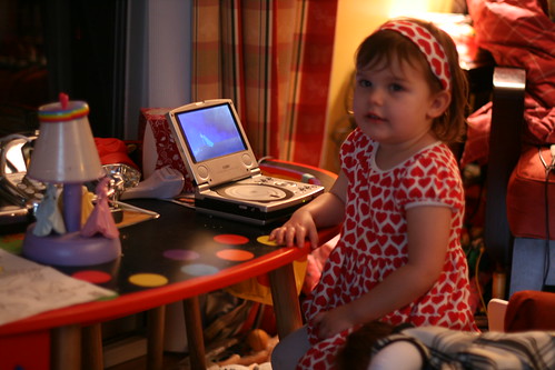
Bad!
See how it's hard to focus on the kid with all that crap in the background? It's distracting, and Alexis is so small in the photo that you can't really see her.
But if I move in closer, it's a much better photo:
(Totally a crappy set of photos, but they serve the purpose.)
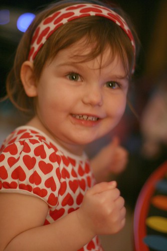
Here's another example of filling the frame with kid:
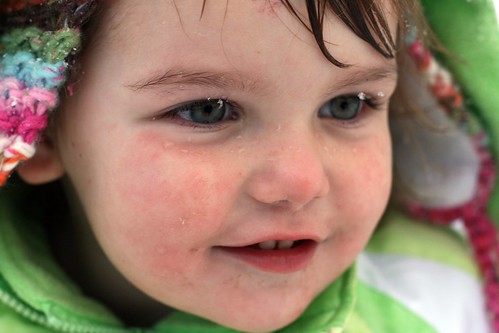
It's no secret that I lurve me some extreme close-ups. I happen to think kids have the most incredible facial expressions, and the only way to truly capture them is to get close. (BTW, I have been using a 50mm lens--i.e. NO ZOOM--since mid-December. So far I have found that using my legs to get closer to what I'm photographing is much better than any kind of camera zoom because it forces me to really "see" what I'm trying to get in the frame.)
Of course, sometimes you want to photograph more than just a kid's face. You still probably want to fill the frame with kid. Like this:
Just to complicate things, there are times when the "rule" is meant to be broken. Like this one:
In that photo, it's the white space that makes the photo. If Alexis were filling the entire frame, you wouldn't be able to see the trail of footprints, or the otherwise undisturbed snow. All that blankness gives the photo a certain tone, and that would be lost with a close-up.
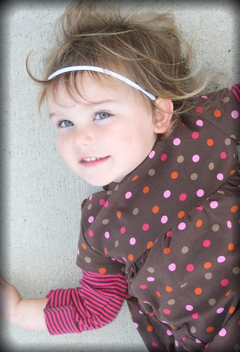
I tend to check my backgrounds and figure out if they detract from the photo. If they do, I move closer. Once I think I'm close enough, I move even closer. That's how I end up with a lot of photos that I'm happy with. Like this oldie but goody.


